The final project of the courses ARCH101 and ARCH121 were both about the building Cinnah 19. We were expected to write comprehensive essay on the building for ARCH 121 and produce a informative poster which includes both axonometric and ortographic drawings and sketches. Here it is.
Category Archives: ARCH111
Drawing for my Project
Here is the drawing which includes the library of relations and the ortographic drawing of my model for ARCH101.
Axonometric Drawing
We learned how to produce an axonometric drawing. We used this axonometric projection technique to introduce the layers and reference lines in our exploded assignment. I’ve used 30° to 30° and draw dotted lines to emphasize the lines which are in the bottom and invisible. Here’s my work.
Explode
After we had submitted the composition we made by 4 layers, we were asked to explode those layers. This time our structural elements were 4 mm sticks. I used 7 of them, length of 20 cm for the stability. The points that the sticks are passing trough should be the spesific points in terms of the context. In other words, sticks are not only a structural element but also a part of the composition.
This is how our studio looks, after the submission. 🙂
Superimpose and Creating New Relations
In this assignment we were expected to superimpose the previous assignment and see those lines and planes as a whole. So we took a photocopy of the 3 layers to achieve the superimposed one.
Then we need to unfold this photocopy into 4 layers that one will be the wire, one will be the cartridge paper and two will be acetate sheets. Wire should be folded in 90°, cartridge paper should cut and we need to draw lines on aceatet sheets. With those 4 elements I created the composition below.
Fragmented
In this assignment, we were asked to abstract all the printing process that we had observed in Dogan Printing Center. The only material that we could use was a blue styrofoam and the only action that we could perform was cutting the strofoam in one direction. So the thinking process was the cruical part in this assignment. After this process I decided to focus on the actions which every paper experience.
As a postscript, I have to state that every gap in my project is reffering to something. The gaps are not just used for separating the units, they are also a design elements. Briefly, in my project the gaps are as important as the styrofoams.
Okay, now I can talk about my work. As I mentioned before, four metal planes create a paper. These two styrofoams and two gaps on the left hand side are 4 elements in total, which are representing the metal plates. And then next to them, there are two identical sized styrofoams and also two gaps, which are also represents the copying process of a paper. First there is only one and then the number of papers is increasing by the copying operation. Right next to it, there is a single syrofoam 2 times bigger than the left one. It represents the unify operation, because in the printing process two paper always come together like the pages of a newspaper. And the right had side one which is bigger, represents the bringing together process, like tens of pages are coming together and create a single newspaper.
The following assignment was creating 3 layers that should refer the previous project. We used 3 transparent paper and colored pencils. We were expected to draw continous lines and planes (which are also should be hatched by the continous lines). So I thought I could specify the previous actions with different aspects. I used the diversity of the type of actions as an inspiration. For example “copying, creating, and then copying again” and assign every action diffent kind of plane. I show the “copying” part with lines which are very close to each other, and “creating” with hatching. In the second layer I used the duration of the actions as an inspiration. In the long processes I used bigger planes. Third layer was about the placement of these operations. And I tried to find some reference lines, and those three layers and also the styrofoam could intersect properly. We should also reflect the idea of “rhythm” as we learned from the workshop that I mentioned before. The changings among the colors are visible and actually shows us the intersecting planes. Here is the final look.
Thematic Photo Essay
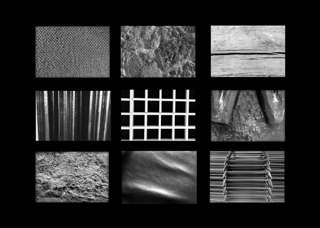
In this assignment, we were expected to produce a photo essay around the theme ‘texture‘. I visited the specified places to observe textural differentiations caused by light & shadow conditions. Those were the main elements that must be seen in our projects.
I visited two of the given places which are Cermodern, Ulus and Mimarlar Dernegi, Cankaya. I preferred to take the photographs with the morning light, in order to make the light & shadow conditions more tangible. It was one of my learnings from the architectural photography techniques course, by the way. 🙂 Also I tried to focus on only one texture in one photograph. In other words I concentrated on just one planar element in one photo. I zoomed in, just to show the textures better and bigger. And it became easier for me to show the material qualities with this manner.
Since it was supposed to be a photo essay, I should have created a relationship among the photos. So I thought, I can take all the photographs with the same angle, which is 90°. Here is the poster I produced.
From Text to Poster
It was a joint assignment of the courses ARCH111 and ARCH 121, so it was not only designing but also a reading assignment. We need to study the text “Le Corbusier. Towards a New Architecture” and find some keywords from the text. Then what we need to do is prapering a poster with given sizes as an interpretation of what we understood from the text about the topics Mass and Surface. The poster should include those keywords that I mentioned, an alternative title that we are supposed to find. We also allowed to use an image in an abstract manner.
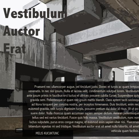
I preferred to use a black-and-white photograph for the background and I made it semi-transparent in order to make the words readable. I also used different font sizes to emphasize the important words.
Abstracting Space
This assignment has more than one step and lasts about a few weeks. In this post I’ll try to explain these steps and show my working process. At the first step, I basically drew the school building without using any measuring element or ruler. It was more like a sketch, actually.
Secondly, in a group of five we measure the building by using one friend’s arm. In other words, we use her arm as a measurement unit. Then with the help of this process, it became so much easier to abstract the building with the correct proportions.
Next step of the assignment was producing a composition of previous drawing with 3 materials. They were a model cardboard, pins and three types of acetate sheets (transparent, sanded and coloured one). In my project, different types of acetates are representing different spaces. I also tried to emphasize the hierarchy among layers by overlapping them.
At the 4th step, we were asked to rotate 90⁰ and explode our previous composition on x-axis. The materials were again acetate sheets and a wire. But it was supposed to be a single continous wire, so it was so hard to control and shape. On the other hand the wire is also a part of this composition therefore, I tried to make it simple and straight. Unfortunely the instability and softness of the wire didn’t let me. ![]() Here’s the final look of my work.
Here’s the final look of my work.
My First Photoshop Experience
It was the first assignment that we should prepared with Photoshop. We were asked for to design a poster in given dimensions, with the given elements: an image and a text. And it should also include a title and our name on that poster. I used Adobe Photoshop CS4. To be honest, it wasn’t as easy as it looks, because I wasn’t experienced enough and there was too many options that I couldn’t decide on which one I should use. I wanted to make it simple, therefore I used a filter on given image to simplfy its appearance and created a semi-transparent layer to make the text easy-to-read. Here’s is the one I designed.


